How do Logos Create Brand Identity
Posted on 4th January 2019 at 14:12
Brand identity is the bringing together of elements that distinguish your product or service to people. These elements allow you to establish the image you want for your brand and send the right message across your target audience. Some components that help build your brand identity include: brand name, theme line or tagline, and perhaps the most prominent of all— the logo.
A survey conducted by Avery UK revealed among over 2,000 respondents revealed that 67% of them will buy only from brands they are familiar with. And for 53% of these respondents, familiarity makes them trust a brand more. It is notable that the brands that they are most familiar with are those with the most popular logos in the UK. These include: Coca-Cola, McDonald’s, Mickey Mouse (Disney), Cadbury and Apple.
Logo Design Checklist
But creating a logo that makes a lasting impression on your customers is not that easy. For you to make an impact, you have to take some things into consideration. Here are some factors you must keep in mind when coming up with design:
It must be visually appealing.
It must make an impact.
It must align with company’s short-term and long-term goals.
It should send your brand message across to your audience clearly.
It must have an enduring appeal.
It must adhere to the industry standards.
Creating Brand Identity with Your Logo Design
Now that you know what your logo design checklist should contain, it’s time to go to the nitty gritty of how to make a logo that effectively establishes your brand identity. Here are some pointers:
1. Know and Understand Your Target Audience
Know and develop buyer personas. Figure out your target audience’s gender, age, education level, income, and any relevant information about them. Find out what they like and what makes them tick. Understand their lifestyle. Knowing these factors will allow you to know exactly who you’re selling your brand to and craft the right logo to attract them.
2. Stick to the Basics
Don’t try to say too many things with your logo design as you might confuse your audience on what your brand is really trying to communicate. Keep it simple and focus on which elements will add value to the buying experience of your prospective customers. Make sure that apart from embodying your brand identity, the design of your logo resonates with your target audience as well. Establishing that connection is crucial in creating a brand that converts.
3. Be Consistent
According to Hannah Hagee of Lucidpress, there is a reported 23% increase in revenue when a brand is presented consistently. So make sure the message you are communicating via your logo is consistent across all your marketing platforms. Check if the typography and graphics complement the logo as well. Also, make sure you regularly put out content to increase the chances of brand recall. A compelling logo is nothing if it won’t be regularly visible.
4. Pick the Right Colours for Your Brand
Your logo’s colour can also affect how your prospective customers receive your brand (see the graphic above to to learn which colours evoke which emotions).
The right colours can make or break your brand. In fact, a study by University of Loyola shows that colour boosts brand recognition by up to 80%. One example of a brand that can easily be identified by its logo’s colour is Coca-Cola. While the reason behind the red logo was brought about by a labeling protocol rather than a deliberate branding decision, it has endured and made a mark in the minds of its consumers for around 130 years.
5. Mind your typography
When crafting your logo’s wordmark, it’s important to put much thought into the typeface that you will use. Sloppy typography can turn off potential customers and reflect badly on your business. So make sure you choose the right typeface for brand. Also, brush up on the basic principles of typography so you’ll know which rules you should follow, and which ones you can break.
6. Create a Style Guide
Once you’ve figured out the profiles of your target audience, came up with your brand message, and decided on which font, colour, and graphics you will use for you logo, it’s time to compile them all into a style guide. This way, it will be easier for everyone in your company to familiarize themselves with the style principles they have to follow when working on your brand’s collaterals.
7. Be adaptable
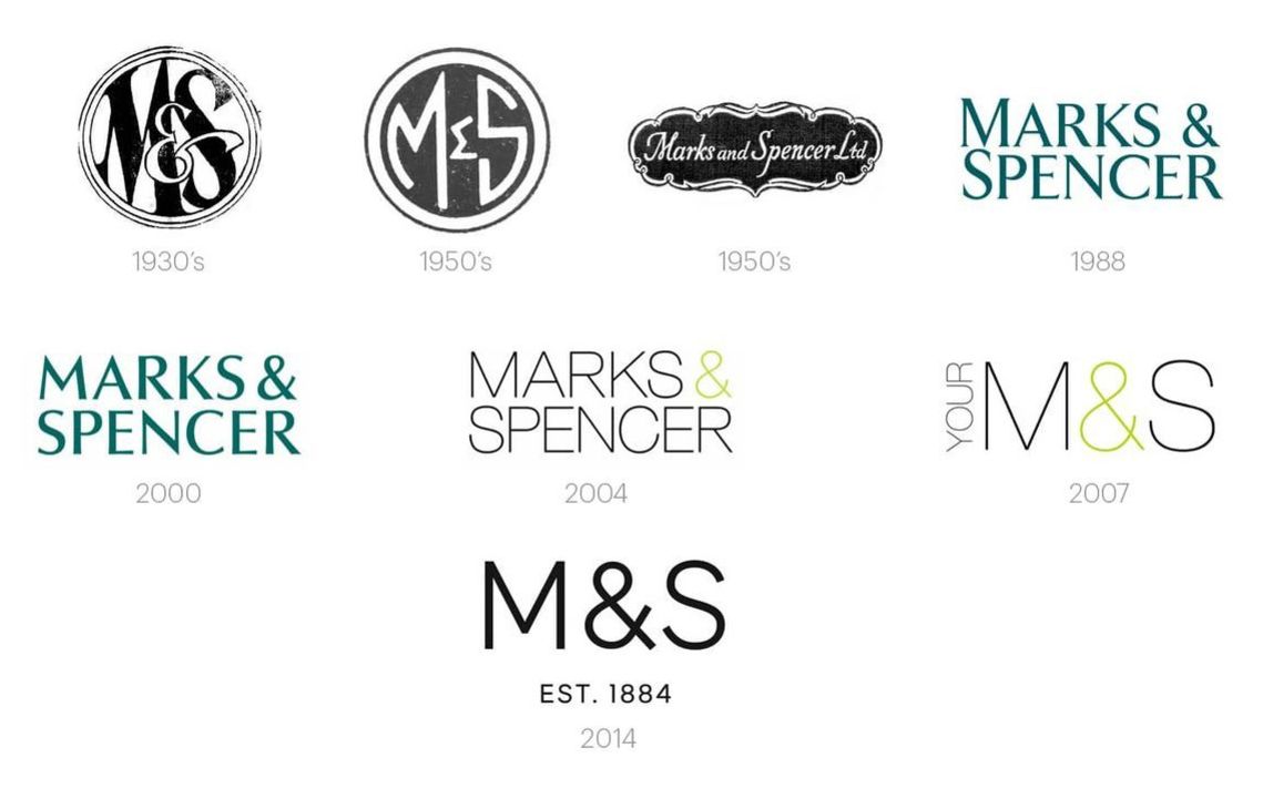
Having a classic logo will save you from having to update it all the time. However, there will come a time wherein you’ll have to adapt to certain industry trends to better connect with your consumers. Take retail brand, Marks&Spencer for example. They have continuously redesigned their logo to adapt to the changing times. This openness to change is necessary to keep your brand relevant after a certain period of time.
Conclusion
Logos are definitely more than just a means to identify a certain product or service. It has now evolved into a marketing tool that helps you appeal and connect to your audience in a deeper way. Hopefully by implementing the tips above along with a sound branding strategy, you’ll be able to reap the benefits of having a well thought out logo for your business.
Share this post:


