


The Psychology of Colour in Sign Design
Posted on 24th September 2018 at 09:33
Colour can significantly affect the way we feel, which is why making the right colour choices is always so important regardless as to whether you’re selecting a new colour palette for your website or the most appropriate shirt to wear to a business event.
Pablo Picasso once noted that colours can follow the changes in our emotions and we still use colour-based phrases in everyday conversations to express ourselves. For example, “I’m seeing red” is widely used to express anger, and “I’m green with envy” is an effective way to convey feelings of jealousy. Whilst, colour psychology is nothing new, it is only recently that businesses have begun to realise the power of colour to impact and influence potential customers.
As any business sign is, by its very nature, highly visible, ensuring that you select the correct colour palette is crucial.
UNDERSTANDING COLOUR AND YOUR TARGET MARKET
Responses to colours will vary greatly depending on personal experiences and as such, particular shades can evoke very different feelings in different people. Just as interior designers have mastered the use of colour, good brand marketers should also take the time to develop an understanding of how to leverage the psychological power of colour.
When approaching colour in sign design, carefully considering your target market is critical. Selecting an inappropriate colour could communicate a very different message to the one you originally intended and perhaps even mislead the people you most want to impress.
It is important to note that as colour perceptions can differ hugely between different countries and regions, if you are operating in a global market you should carefully consider the potential cultural implications of your preferred colour choice.
SELECTING A COLOUR TO REPRESENT YOUR BRAND
Understanding the effects particular colours might have on your target audience will help you to determine which shades are most likely to achieve an outcome that will positively affect your business.
Numerous studies have shown the power of colour on brand personality, whether increasing the comprehension of your brand by as much as 73%, and boost your brand recognition by as much as 80%.
Let’s look at each individual colour in turn.
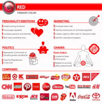
RED
Often associated with fire and the sun, red is widely considered to be a stimulating colour that can prompt people to step outside their comfort zones and take a few risks. Red can also stir the senses and provoke a feeling of energy, love, power, danger, and/or aggression.
In a marketing context, red is used to create a sense of urgency amongst shoppers in clearance sales, to encourage impulse purchases, and by restaurants to stimulate their diners’ appetites.
YELLOW
Like red, yellow is also a colour that can stimulate very strong feelings, particularly of hope and optimism. Representing youthfulness and clarity, yellow can capture the attention of consumers, inspire feelings of happiness and encourage communication.
Conversely however, yellow can also sometimes strain the eyes and cause fatigue.
BLUE
Calming and serene, blue is often linked to cool seas and soothing blue skies. In addition to stimulating feelings of cleanliness, order, security and trust, blue is a relaxed colour that can suppress appetites and even lower blood pressure.
As a productive, trustworthy and non-invasive colour, blue is often used in corporate business settings and is the most used colour within offices because it boosts productivity. Notably, blue is the world’s favourite colour and though typically more popular with men, women still tend to choose blue more frequently than any other colour.
ORANGE
Another warm, stimulating colour, orange is energetic and invigorating. Often used to encourage impulse purchases, orange is an excellent choice for confident, friendly, and cheerful brands.
Reflecting enthusiasm and excitement, orange is a particularly effective colour for marketing calls-to-action.
GREEN
Typically associated with health and nature, green also often provokes feelings of jealousy and good luck. In retail spaces, green can promote a relaxing ambience. It also symbolises money, wealth, and new growth.
The human eye is particularly sensitive to green tones and certain shades can also alleviate feelings of sadness.
PURPLE
Soothing and calming, purple is often associated with royalty, wisdom, wealth, success and spirituality. Purples represent imaginative and creative brands well and are often used in marketing campaigns within the beauty industry.
STANDING OUT FOR THE RIGHT REASONS
If you find that many of your closest competitors have selected the same colour palette for their signage, you might benefit from thinking outside the box and choosing colours that will help your potential customers to easily differentiate your business from the rest of the crowd.
Remember, selecting the right colour for your signage will help you to efficiently communicate your core values and objectives directly to your audience. For this reason, you will likely find it beneficial to conduct some audience testing before you ultimately go on to produce your sign and proudly display it to the world.
By deftly conveying feelings and emotions, colour goes far beyond simple aesthetics. So, make sure that you are communicating the right feelings and messages to successfully connect with your target audience.
Need help designing your signs? Signman have years of experience helping businesses across Bristol & Bath stand out and make the right colour choices for their signs.
Share this post: